Can I rely solely on the Generation Capacity Map to plan my project’s location and capacity needs?
No, you cannot rely solely on the Generation Capacity Map for verifying project capacity needs. This tool is designed for information purposes only and to identify potential areas of interest for power generation projects. Customers must use the Hydro One Station Capacity Calculator to verify capacity needs at their project location and submit a Preliminary Consultation Information Request (PCIR) for further information.
What should I do if the Map shows limited generation capacity?
The information on the Generation Capacity Map is for information purposes only and must be verified by the Hydro One Station Capacity Calculator. The closest feeder to the proposed project location does not necessarily mean that it will be the feeder you will be connected to. We will confirm the feeder you are being connected to during the connection process.
Will the Map confirm which feeder I am connected to?
The Generation Capacity Map is not designed to confirm which feeder you could be connected to. It is designed to show feeders where generation capacity may exist. We will confirm the feeder you will be connected to during the connection process.
How do the layers work?
The generation capacity feature layers allow you to see the maximum available generation capacity in Ontario based on the type of Distributed Energy Resource (DER) you are planning to connect to our distribution system. Please see the steps to consider below before selecting the layer:
Steps:
- If you are trying to connect an inverter-based net-metering DER such as solar panels and your project size is 12 kW or less, please select the Micro DER layer only.
- For DER projects larger than 12 kW, you must consider the DER program and the DER interconnection technology.
- For inverter-based DERs such as solar or Battery Energy Storage Systems (BESS):
- If you are exporting power into the grid (e.g. Net Metering): Select inverter based exporting layer
- If you are not exporting into the grid (e.g. Load Displacement): Select inverter based non-exporting layer
- For a non-inverter-based DER (synchronous or induction machines), such as a natural gas generator or a wind turbine:
- If you are exporting power into the grid (e.g. Net Metering): Select non-inverter based exporting layer
- If you are not exporting into the grid (e.g. Load Displacement): Select non-inverter based non-exporting layer
What do the different colours represent on the Map?
The colour-coded regions on the map show the available generation capacity for that area. The legend menu on the right side of the map screen will show what each colour represents. If there are multiple feeders in a specific region, the map will automatically use the feeder with the highest available generation capacity and will display the colour associated with that capacity. Please note, the Micro DER layer has its own colour convention and uses different values from the other layers. Clicking on a specific region, will show the list of feeders within that region regardless of the top layer colour.
If there is available capacity in my desired area, how early should I contact Hydro One to secure capacity for my project?
To secure capacity for your project, follow the standard process of applying for your proposed project connection at your earliest convenience. Please visit our Generators page for additional information regarding generation connections to our distribution system.
Does the Map indicate where I can connect my Distributed Energy Resource (DER) project?
No. The Generation Capacity Map will show the available generation capacity on our distribution feeders, but the map will not tell you the exact location where your DER project can connect to our distribution system.
I see multiple feeders near my house, how do I know which one to pick?
The Map displays areas of generation capacity. In order to determine which feeder to connect to, you must follow the connection process.
Are there any costs associated with accessing or using the Generation Capacity Map?
No, there are no costs associated with accessing or using Hydro One’s Generation Capacity Map.
How often is the Generation Capacity Map updated?
The Map is scheduled to be updated monthly.
What is the “Find capacity near me” feature?
This feature on the Generation Capacity Map allows you to drop a pin on the map to find available generation capacity based on the radius you have specified.
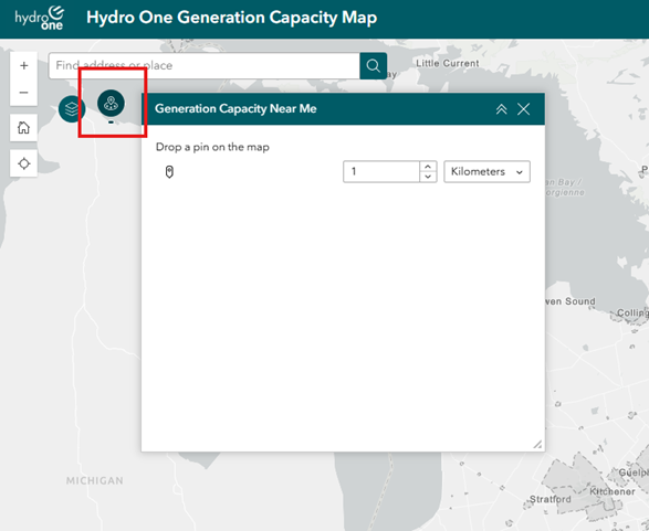
You can access the tool by clicking the icon in the top-left corner of the Map. First, set the radius (in kilometers) to specify how far from the dropped pin location you want to search for available generation capacity.
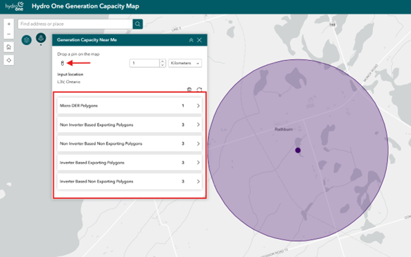
After setting your desired radius, click the “pin” icon and choose a spot on the Map. This will drop a pin at the location and show all feeders with available capacity for the type of generation you want to connect.
Why are there areas with no information and/or blanks within Hydro One’s service territory?
Our map works by creating a shape around each feeder that shows its approximate location and capacity. When shapes from various feeders are put together, there can be gaps between the shapes.
How do I change the basemap layout to a satellite imagery view?
You can change the Map’s basemap layout to suit your preference. By default, the Map shows a light grey basemap theme. To pick a different style, click the basemap gallery tool in the top right corner of the page and choose the one you like.